Ooit, op vakantie in Polen, moesten we zóeken naar de winkels.
Het was niet lang na de val van de muur en in de dorpen op het platteland zaten ze verstopt in wat gewone woonhuizen leken. De kleine, dubbelglas ruitjes boden weinig zicht op de inhoud. Uithangborden waren er nauwelijks, en voor ons onleesbaar (Sklep). De bewoners van het dorp wisten toch wel waar ze moesten zijn en er was geen concurrentie.
Ik zie in de stad alle opschriften. De winkelpuien, de affiches, de straatnamen, de reclames; er ontgaat me weinig. In Amsterdam is het extra opletten als op woensdag de reclames en affiches in de abri’s gewisseld zijn.
Typografie en materiaal verschillen enorm per wijk, dat is hier in Berlijn nog opvallender. De buurt waar ik nu woon (Prenzlauerberg) is hip en dat zie je natuurlijk terug in het type winkels; veel bio, dure bakkerijen, mode- en interieurzaken. De gevels zijn smaakvol, de namen van de winkel klein geplaatst, bescheiden in kleurgebruik, allemaal zoals het hoort, maar nergens opvallend of spannend.
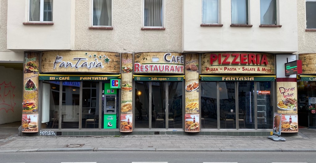
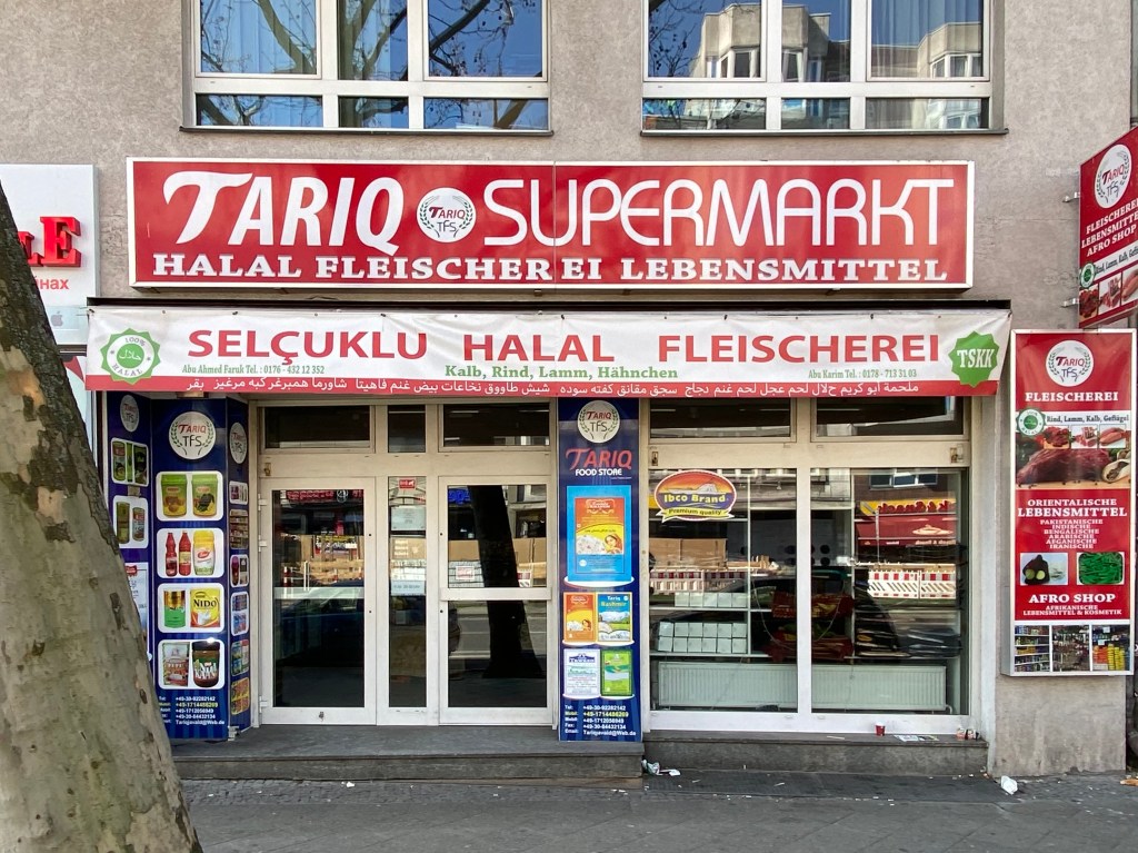
In Kreuzberg, waar de meeste winkels in Turkse handen zijn, knalt het je tegemoet. De namen van de zaken en vooral wat ze er verkopen worden breed uitgemeten, liefst over de hele gevel. Er wordt vaak gebruik gemaakt van foto’s op lichtbakken, zo van de computer naar de printer-op-reuze-formaat. Veel döner kebab natuurlijk, shisha lounges, kappers, Fleisch und Lebensmittel en baklava bakkers.
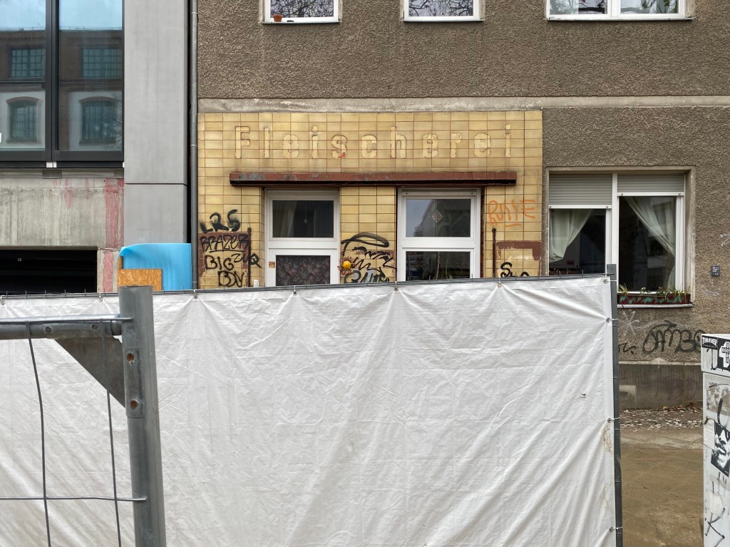
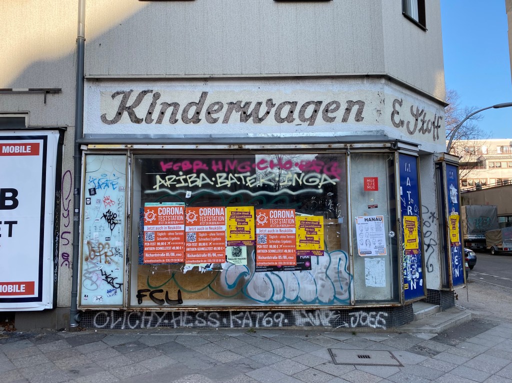
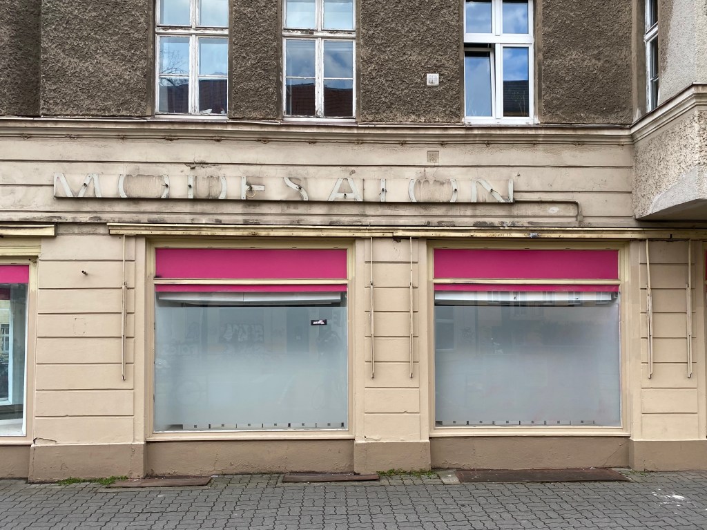
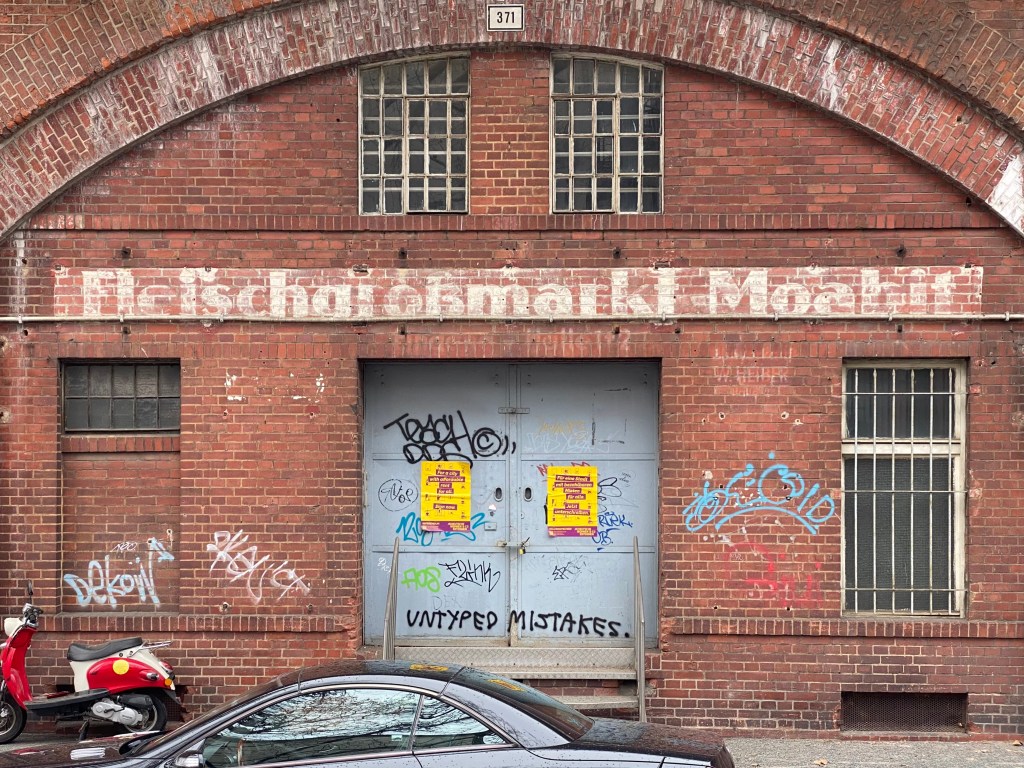
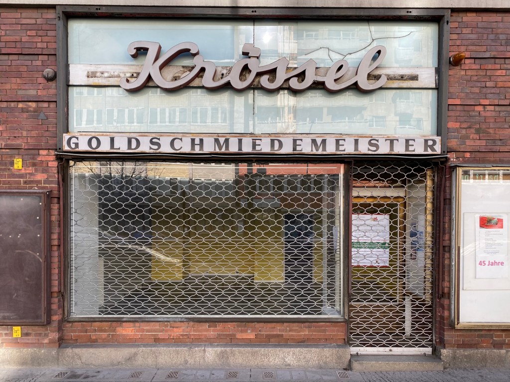
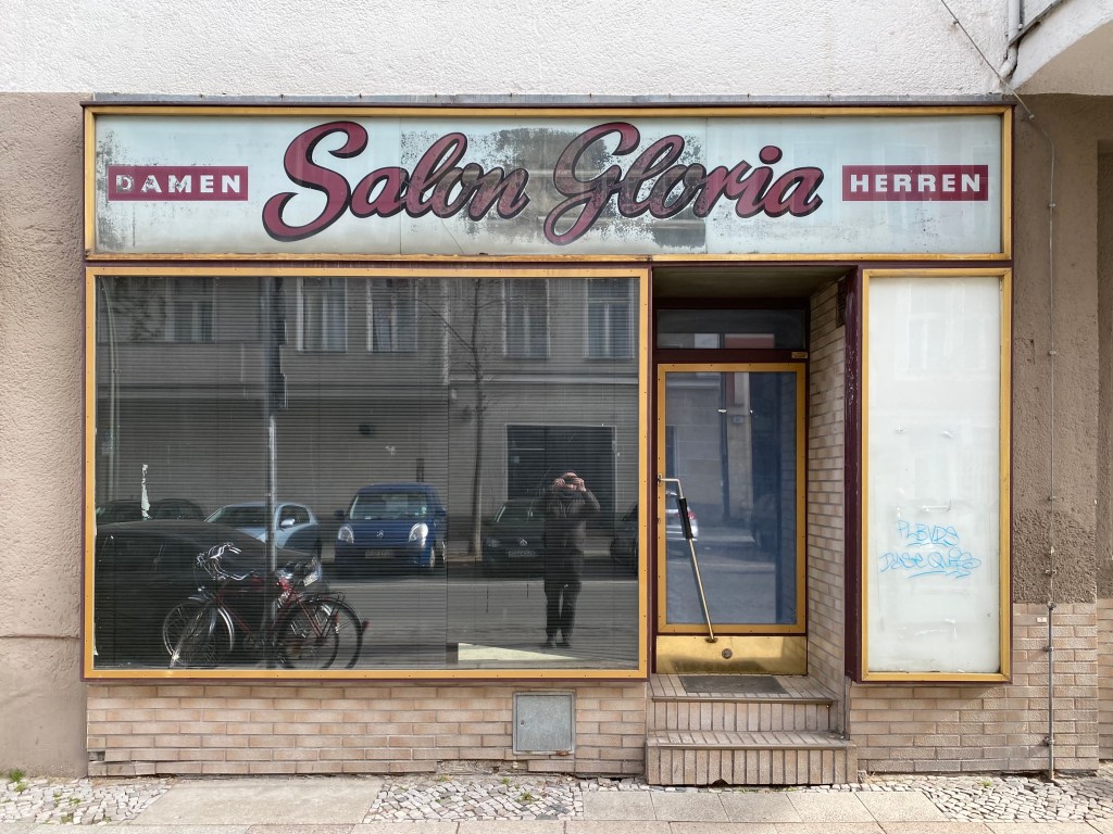
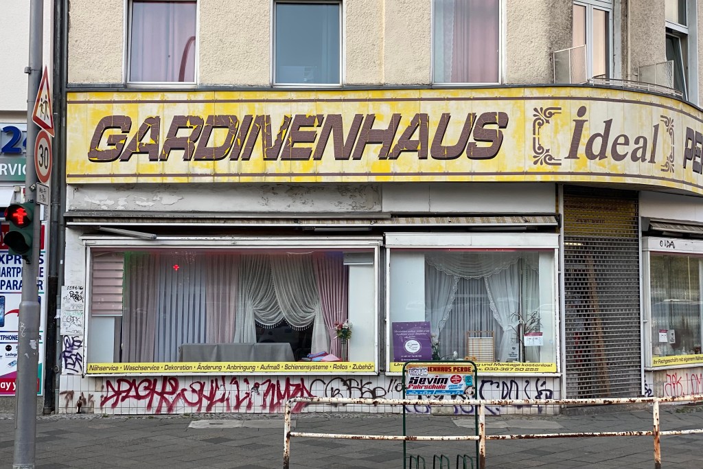
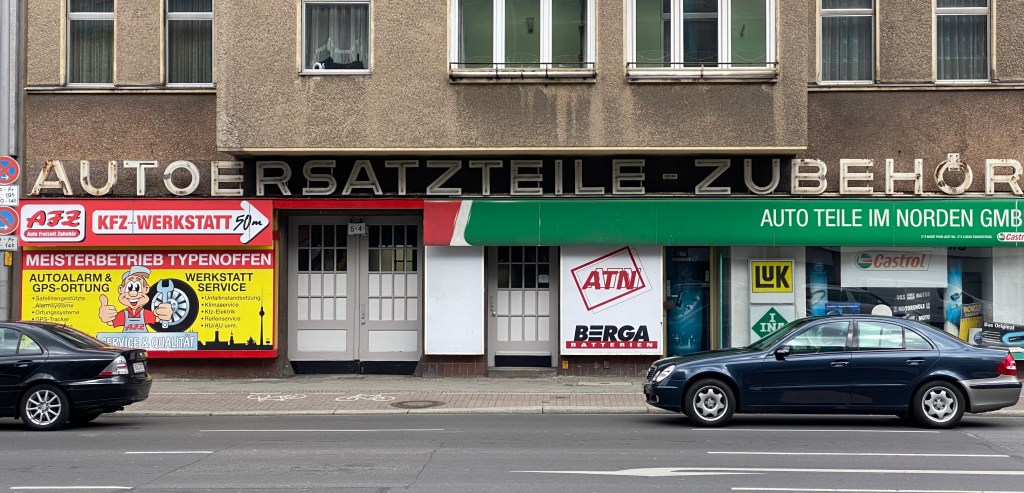
Vrijwel nergens zie je meer handgeschilderde of lichtgevende, losse letters. De winkelpanden met een mooie belettering, die ik af en toe tegenkom en fotografeer, zijn zeer zeldzaam. Meestal staan ze leeg en in afwachting van een grote verbouwing gestript, waardoor de voormalige belettering even vrij komt.
Once, on holiday in Poland, we had to search for the shops.
It was not long after the fall of the wall, and in the rural villages they were hidden in what appeared to be ordinary houses. The small, double-glazed panes offered little insight into the contents. There were hardly any signboards, and unreadable to us (Sklep). The inhabitants of the village knew where to be anyway and there was no competition.
I see all the inscriptions in the city. The storefronts, the posters, the street names, the advertisements; little escapes me.
Typography and materials differ enormously per neighborhood, which is even more striking here in Berlin. The neighborhood where I live now (Prenzlauerberg) is hip and you can of course see that in the type of shops; lots of bio, expensive bakeries, fashion and interior shops). The facades are tasteful, the names of the store are small, modest in use of color, all as it should be, but nowhere striking or exciting.
In Kreuzberg, where most of the shops are in Turkish hands, it hits you. The names of the businesses and especially what they sell are widely spread, preferably across the entire facade. They mainly use photos on light boxes, so straight from the computer to the printer-in-giant format. Lots of doner kebabs of course, shisha lounges, hairdressers, Fleisch und Lebensmittel and baklava bakers.
Hardly anywhere do you see hand-painted or luminous, movable letters anymore. The shops with beautiful lettering, which I occasionally come across and photograph, are very rare. They are usually empty and stripped in anticipation of a major renovation, leaving the former lettering visible for a while.
Het is een beetje flauw, maar ik kan het niet laten er nog een afhaalzaak uit de DDR tijd bij te laten zien. EINTOPF, een stevig eenpansgerecht, EIS, nog net leesbaar in het luikje, en LECKEREIEN, een -meestal zoete- lekkernij, met een punt op de hoofdletter i.
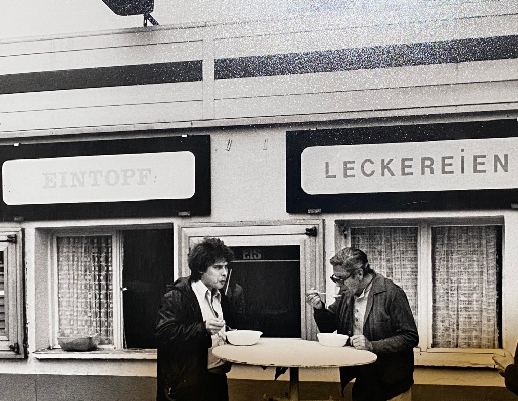
Sorry, but I can’t help showing another takeaway from the GDR era. EINTOPF, a hearty one-pot dish, EIS, barely legible in the hatch, and LECKEREIEN, a mostly sweet treat, with a dot on the capital i.
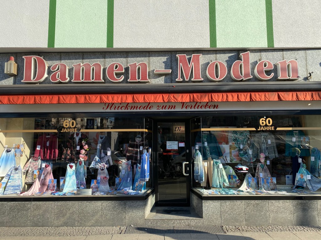
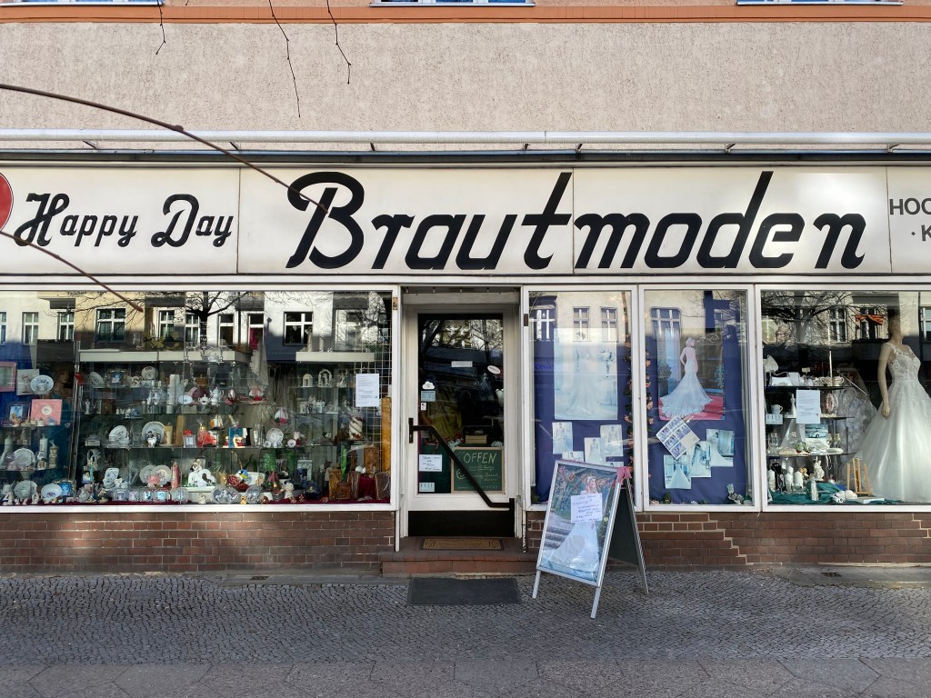
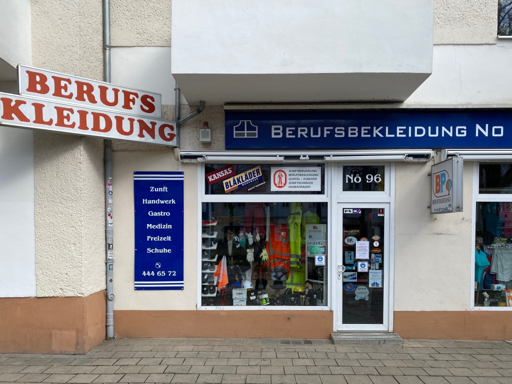
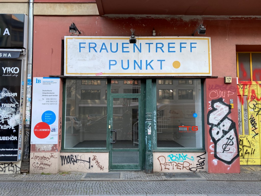
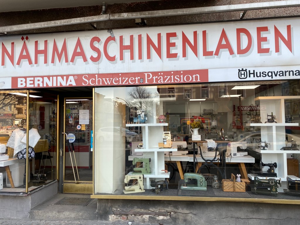
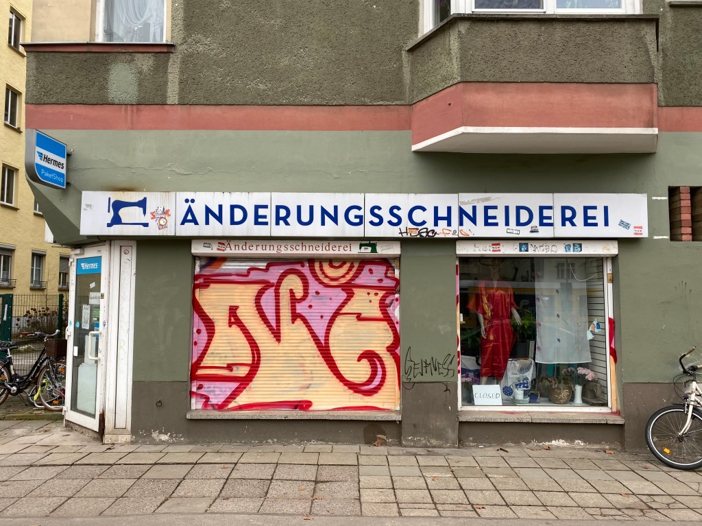
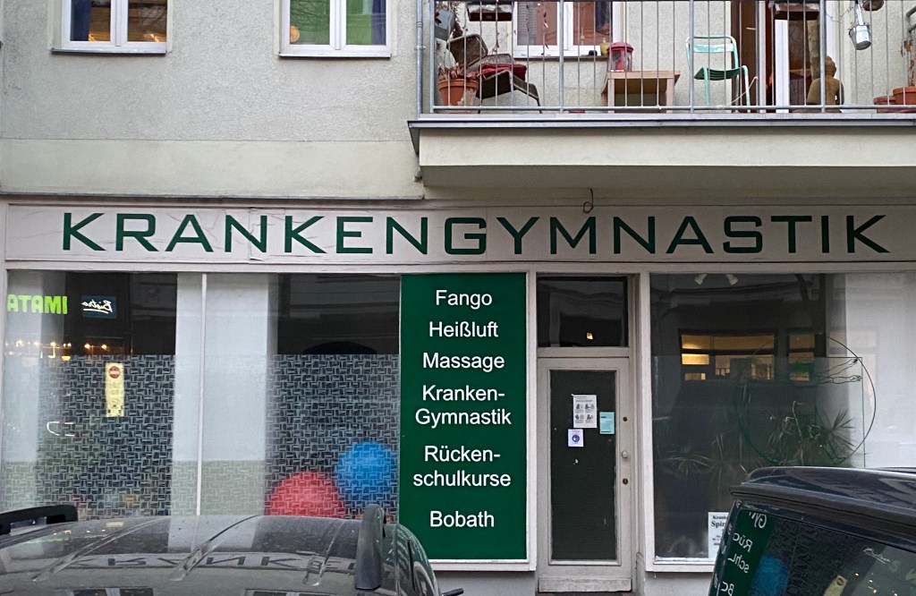
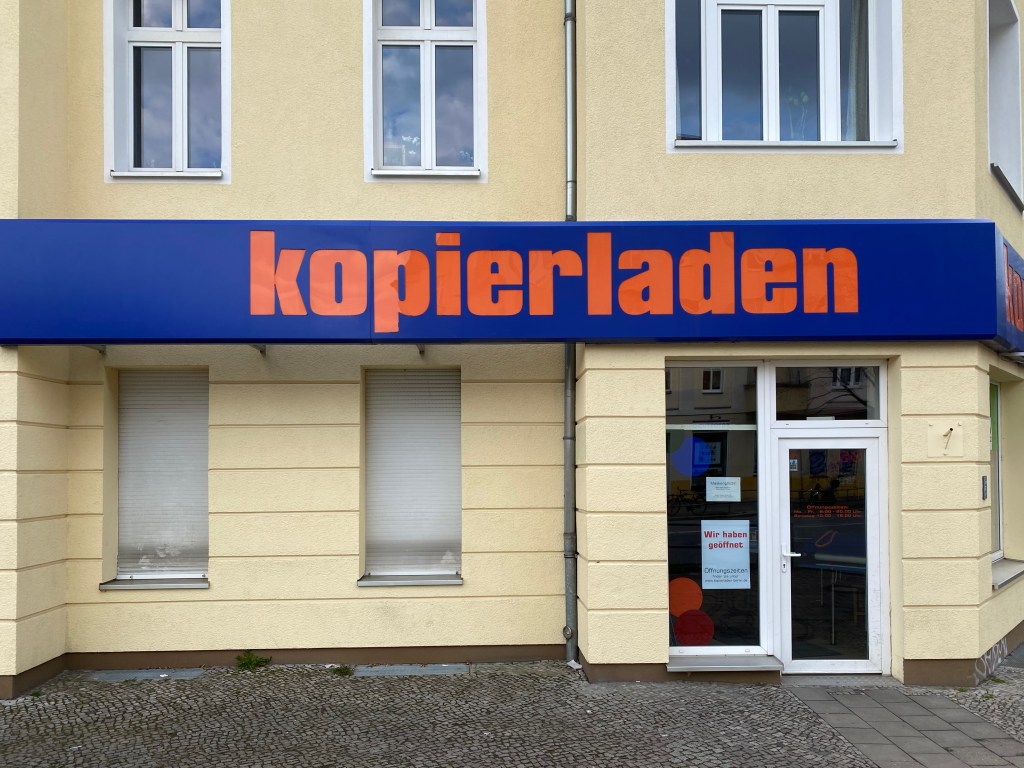
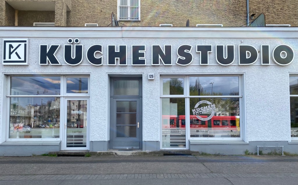
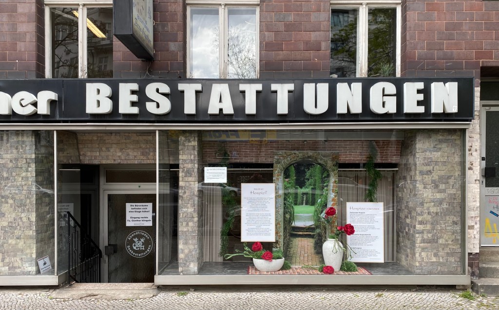
Het valt me op dat borden boven de winkelpui, meer dan bij ons, aangeven wat er te koop of te doen is. En dat zijn soms enorm lange woorden, in forse kapitalen.
I notice that signs above the shop front, more than ours, indicate what is for sale or to do. And these are sometimes very long words, in large capitals.

Er is een mooie film te zien op internet van een groep Amerikaanse ‘signpainters’. Old school typografie met een vaardige hand en de goeie penseel aangebracht. Een uitstervend beroep.
http://www.signpaintersfilm.com/#watch
There is a nice film on the internet of a group of American ‘sign painters’. Old school typography applied with a skilful hand and a good brush. A dying profession.
